Fonts are an important part of your book. They set the mood and can effect the readability of your text. Your book could have potential to be a bestseller but if someone has trouble reading it due to a bad font choice they might just put it down without finishing or recommending it to a friend.
Don’t make the mistake of rushing your font choices or just using your Word processor’s defaults. Take some time to read up on what fonts will or will not work and choose appropriately.
Below are some of the most common types of fonts and information on where they are suitable for use in your book.
Serif fonts:
Serif fonts are fonts that have a little dash at the end of each stroke. Some examples are: Times New Roman, Garamond, Bookman Old Style, and Book Antiqua.
Serif fonts may be used for every part of your book, such as book title, chapter titles, or chapter text. Serif fonts are the easiest to read large blocks of printed text in and should be the only type of font used for the main body text of your book, such as your chapters.
A word on Times New Roman:
Times New Roman was designed for use in newspaper printing presses in 1932 and is not ideal for use in a modern printed book. It is also a very common font and can make your book appear amateurish. I strongly suggest selecting another serif font for your book.
Sans-serif fonts
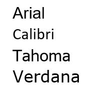
Sans-serif fonts do not have the little line at the end of each stroke. Arial, Calibri, Tahoma, and Verdana are all sans-serif fonts.

Sans-serif fonts are appropriate for the book title, chapter titles, headers, footers, subheadings and any short lines of text such but should NOT be used for the large blocks of text such as chapter text, preface, introduction, etc. Non-serif fonts are not easily readable in printed large blocks of text. This is different than viewing text on a computer monitor, so even if you think your chapter text looks and reads fine in a sans-serif font when viewing on your computer, be aware that the readability will be different when reading it in a printed book form. This has been tested and has been a long held “rule” for book formatting.
Decorative fonts:
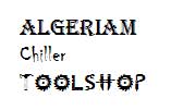
Decorative fonts have some sort of design or artwork element to them as seen below.
These fonts may be used for book and chapter titles but be careful, and make sure that they are easily readable and of good quality.
Caution: Beware Free (Or Almost Free) Font Sources:
Not all fonts are created equal. Be cautious when choosing a font you downloaded for free off the internet or is included in a download with thousands of others for only a few dollars. Many of these are low quality, do not print well, or have good readability. Some may also not have a full character set, meaning they do not have all of the characters needed to type your book. For example, they may not contain a character for the percent sign or the proper quote character. Many of the fonts you get for free (or almost free) do not come with true bold or italics so you should be cautious when using them.
To be safe you should select fonts that you have purchased from a reputable source or that came installed with your word processing program or design software, such as Microsoft Word, Adobe Photoshop or InDesign.
True Versus Fake Bold and Italics
When you need to apply a bold face or italics to your text be sure that the font you are using has true bold or italics font styles. This means that the font has different font styles for regular, bold, italics, and possibly other styles. Each of these font styles will show up as a different font style in your font folder.
If your font does not have these font styles, this when you apply a bold face or italics to your text your Word processing program will apply a “fake” bold or italic by attempting to skew or darken the existing font. The end result when printed in your book will not be ideal. Some printers may even reject your document if it contains fake bold or italics.
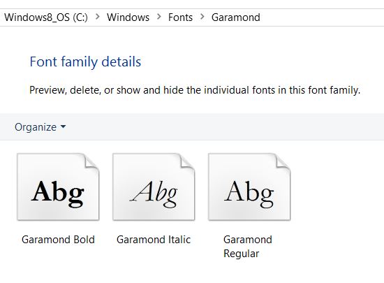
To check your font to see if it has true bold and italics, open your font folder under your computer’s control panel and view the listed fonts. You should see different names for each for normal, bold and italic. For example the Garamond font that comes installed with Microsoft Word lists: Garamond Regular, Garamond Bold, and Garamond Italic. If it only listed Garamond Regular, it would not be using true bold or italics in your document and could cause issues.

Do you have a question about fonts used in book publishing? Post your question below and I will do my best to answer your question.


Yes, but what is the difference in readibility between ebooks and printed books? I read that what is true for ebook is false for printed books and vice versa.
I’m looking for free .otf fonts to include in ebooks, and, as I’m a novice, I can’t find any.
Thanks Kimberly for the informative article. I have a quick question about my non-fiction self-help/personal transformation book.
I have used syirenata script font (hand-writing style) as the name of the book inside a Cloud image on the Title Page. The cloud is a symbolic representation of the story.
A few people thought it gave a non-serious, comical appeal which is contrary to my theme of the book. However, those people are not experts. Would really appreciate your expert feedback on this.
https://fontlot.com/syirenata-script.font
Thanks
Would an easy readable ‘handwritten’ font be okay? I’m writing a book where one of the characters in the story is the author, retelling the events.
For a short amount of text, sure. But not for long blocks of text.
Hello for Europe, Croatia
I’m writing a modern novel per se, but I’m wondering what type of font should use for titles and chapters and what for text ? And, can you help me about paper size, should it be A5 or ?
Thanks ahead !
Hello, I have a book that I am working on about Cutdowns and Comebacks. Here is a sample. What fonts and sizes would you recommend for a 7×7 book? I am stuck! Thanks for your help!
#53
____________________________________________________________________________________
Did you buy your clothes with food stamps?
____________________________________________________________________________________
Government cheese is delicious, everyone knows that. Free food taste better…free clothes however, yeah… not always great. If you don’t have any options other than wearing your older sibling’s jeans from last year or accepting hideous shirts from the local church your grandmother attends, then it is time to wear these comebacks like a brand new pair of Air Jordans.
No it comes from taxpayers like you, so technically you did.
You cannot buy clothes with food stamps. Damn you are stupid aren’t you?
That’d be nice but the government says we are beyond assistance.
Does anyone here know what the font and size of the text in the interior of The Unbecoming of Mara Dyer.
I am confused by piking up which style’s of Fonts.
If anyone could help me so please sent me a message to below email address.
Qudratwasefi@gmail.com – or –
Qudratbarton44@gmail.com
I’m looking for Font style for a book which is about:
Afghan Folk proverbs
so I need a style which have to has a solidarity with the design and color of book style.
And again if anybody could help me please sent their helpless to this:
Qudratwasefi@gmail.com
what is the most readable font for a poetry book? They will be single spaced
is Lucinda Bright too big of a font or too hard to read for the body of a paranormal fiction novel?
I’m looking for a very large font for a children’s book on the comical or cute side. The text will fill one whole page and the picture is opposite it. I wouldn’t know how to get into my Word program, though.
I would like to make a comment on considering the welfare of the reader when it comes to a legible font. It seems on a lot of the blogs I’ve read the author is always doting on what he or she prefers for their eyes. If your a young author, (I mean under 40-50 years of age,) then certain fonts may be well to your liking, but please take a look at the other end.
There are many obstacles for the reader that should be considered. Number one is the age of a person, then the place it is read, (not counting ebooks) such as an airplane with its constant bumps or a beach with the bright sun, or a restaurant where the lighting leaves a lot to be desired.
Going to book sales, book stores and even garage sales I constantly see only middle to upper age group perusing the novels. If I’m out of sync here with the times, I apologize. But it seems the majority of readers are average age or older.
All in all, I love the Georgia font. In my first book I experimented and used Cambria and it was a mistake. It was way too light. I had to resubmit my novel to CS a month later when a few honest friends gave me their opinions. My second and third books are also in good ole Georgia. My only exception is the first few pages of my novel where larger type is used, then I choose a thinner font.
I was in the printing profession for 35 years and a lot of the fine thin fonts in serif or sans serif should only be used on matted stock, not paper back novels. Also the lead space between the lines is very important. I always use 1.25. The color of the stock is a big consideration too. I love the beige color. To me white is way to bright.
That was a really helpful article. I am writing a novel currently, and you are right, a font does set the mood. I’m thinking something more towards an original font, since the time is set in the 50’s.
I learned a lot from reading the info about what fonts to use in printing a book. However your article does not mention what size to use. i.e. 10 12 etc.
Thanks for your comment. I would suggest a 10, 11 or 12pt font size. We typically use a 11pt font.
Kimberly Martin
self-publishing coach
Jera Publishing
Kimberly, you can’t be serious! I suspect you have made an old age mistake and have confused the two, as we all are prone too and I urge you to re-read what you’ve written, please! Sans-serif is what’s easiest to read! The eye gets stuck at the serifs and cannot move easily. That’s the way it is. Sans-serif is always recommended as font for text, but feel free to use it in titles, is what I’m sure you intended to type here.
Otherwise… What peer-reviewed scientific studies or polls do you have to back up your ill-informed and contrary claims?
As for the rest, again you jest! I’m writing in Arial font size 14 and it’s way too small. I was considering switching to bigger font so that us older readers don’t need to use readers but reconsidered. However, trying your suggestion of 10 or even 11, 12 pt is ridiculous: that’s absolutely unreadable! (As is your blog) Whoever in their right mind would buy a book they can’t see the type? Please, please! Unless I landed in a facetious website… let’s stop the madness here!